Mola Cult Brand Identity Design
After a successful launch of Mola Mola-inspired apparel in collaboration with artist Pepper Raccoon, Hank Green wanted to take the idea deeper and launch Mola Cult.
Pepper and I have collaborated before so now she was leading the project, she reached out to me to create a visual identity that would establish the newly founded Mola Cult brand and entice their audience to join their movement.
Inspired by the mysterious vibes of secret societies, the deep, dark nature of the ocean, and the resilient, rebellious attitude of the Mola Mola, I crafted a complete brand identity that brings the Mola Cult universe to life.
Brand Positioning
Make trouble. Blow bubbles.
Initial conversations with Pepper about the ideal strategy illustrated a fun challenge with the Mola Cult brand.
To achieve its goals, this brand needed to balance being mysterious, rebellious, dark, and alternative, with being light-hearted, accessible, and fun.
“Make trouble. Blow bubbles.” was a motto I created as part of the branding process that encapsulates this feeling and guided the way for me. It’s a cult-like, it’s rebellious, it’s tongue-in-cheek, and it’s aquatic. All the things this brand needed to be too.
Solidifying the direction with a distinct moodboard and clear jumping off ideas made this a challenge I had so much fun taking on.

Logo Design
Trippy, tidal typography
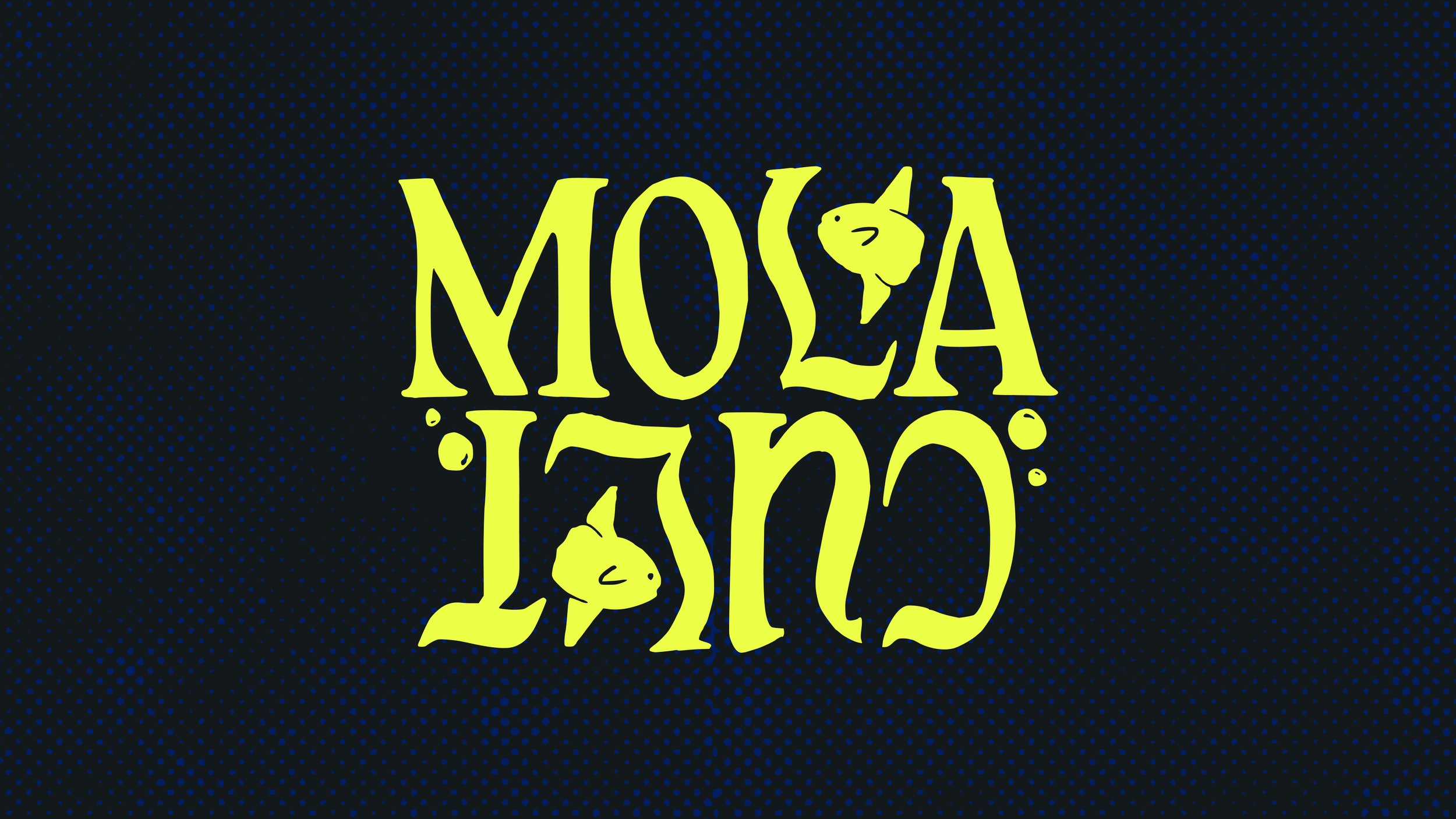
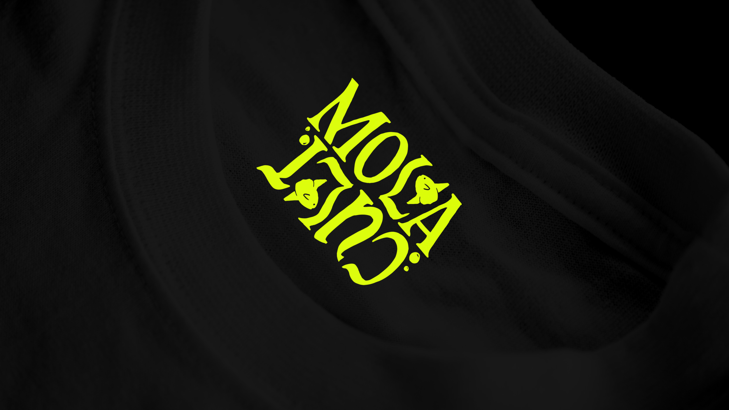
The most stand-out piece of the Mola Cult brand is the logo suite.
We wanted something completely unique that would complement the style of Pepper’s apparel artwork, and sit alongside the rest of the brand identity.
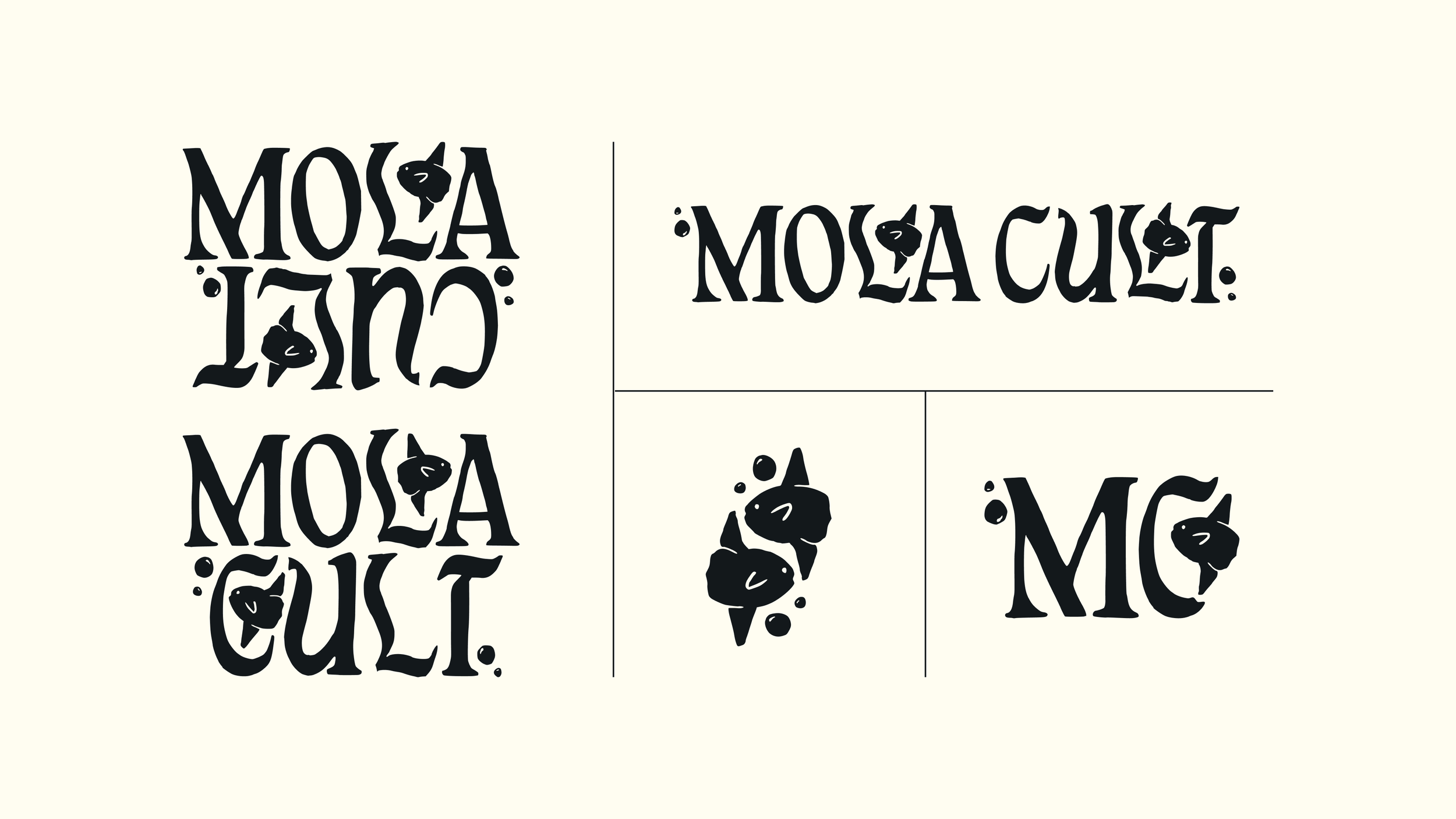
To do this, I created a wavy, bubbly, hand-lettered logo with illustrated mola mola dipping in and amongst the letters.
Initially, I crafted a version with “cult” upside down to show the idea of stepping into this undersea world that turns your expectations on its head, led by a fish that makes no sense. This is fun and works in a lot of situations, but there are certain contexts where legibility is more important, especially as the brand is established. So I also made a “right-way-up” alternative that, alongside the horizontal version can be used when need be to make the name clear. With repetition and increased brand recognition, this will become less of an issue.
The lettering in these logos is a little trippy, sometimes leading to different words or letters being seen initially, but this lends itself to the disorienting nature of the deep, dark ocean, and your indoctrination into the cult of the mola mola.
Brand Identity
Enter the depths
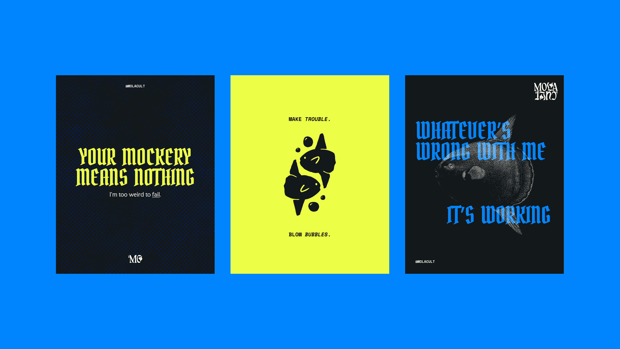
To really take you into the Mola Cult world, I combined elements that conveyed both the literal idea of an undersea society and the attitude of the people the mola hopes to attract.
Overall, we wanted the brand to look alternative, aquatic, cool, fun, and exclusive. Its aim is to feel edgy, relaxed, smart, outdoorsy, and accessibly intellectual.
The alternative blackletter Bokor heading typeface combines with the culty Faculty Glyphic body copy, and the sciency space mono subheadings to create a super specific edgy, intellectual, exclusive feeling.
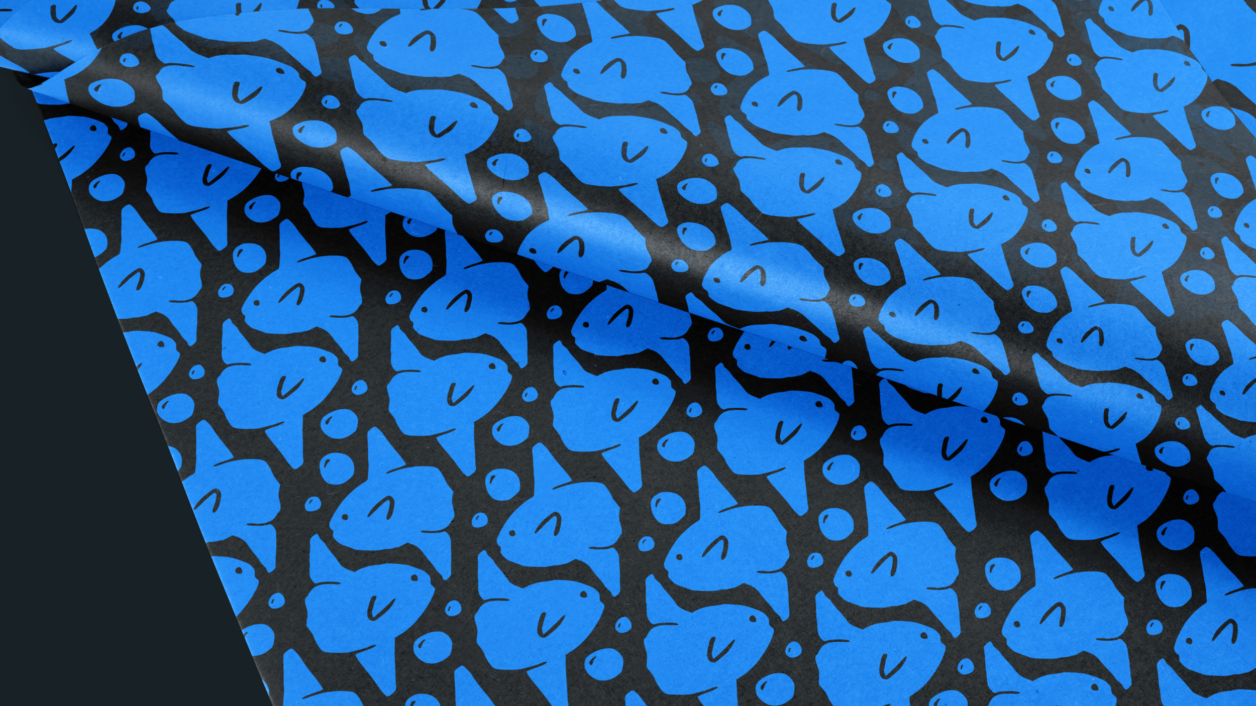
For color palette, I kept things aquatic-inspired, sticking with darker shades to evoke the ocean depths. Then pops of cobalt blue and neon yellow create a bold, modern, rebellious feeling that complements well.
To top it off, half-tone illustrations add to the scientific, intellectual side of the brand, while the subtle half-tone textures bolster the alternative, mysterious energy.
The brand feels both simple and clean, AND deep and layered at the same time, which is exactly what we were aiming for.
““Opening the final presentation was like Christmas morning””
Hank and Pepper are now implementing the new brand and planning new apparel launches with their new assets, so keep an eye out for the latest drops and join the Mola Cult here.