The Climate Hub Brand Identity Design
Meg and Amelia at The Climate Hub have built a uniquely-positioned expert agency providing communications for energy, resources, and environment. While their work is category-leading, their brand didn’t communicate that. To them it felt juvenile but it was difficult to turn into something they loved when they both have different tastes.
I worked with The Climate Hub to create a cohesive, climate-inspired brand that Meg and Amelia both love and are proud to lead their industry with.
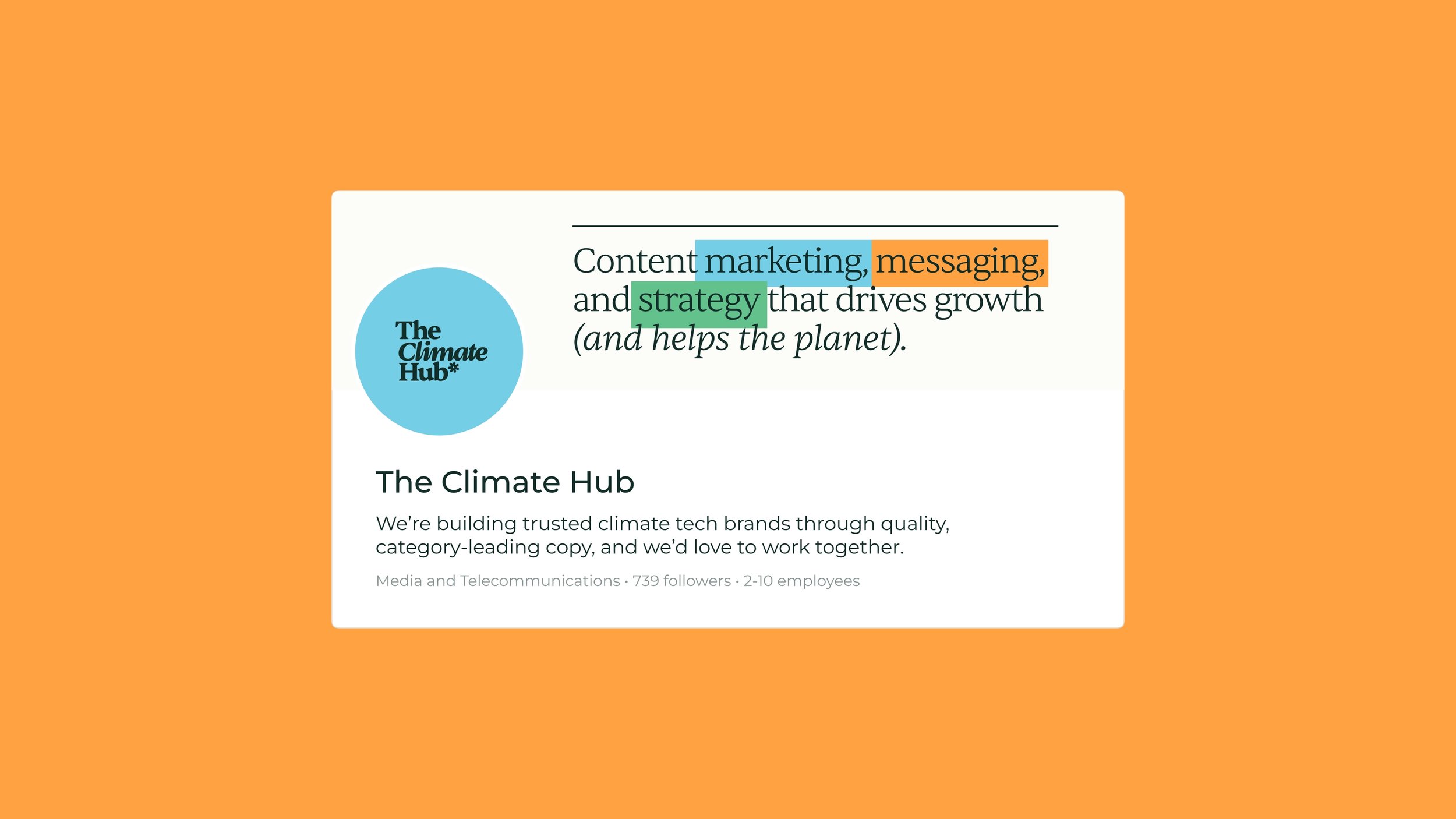
Brand Positioning
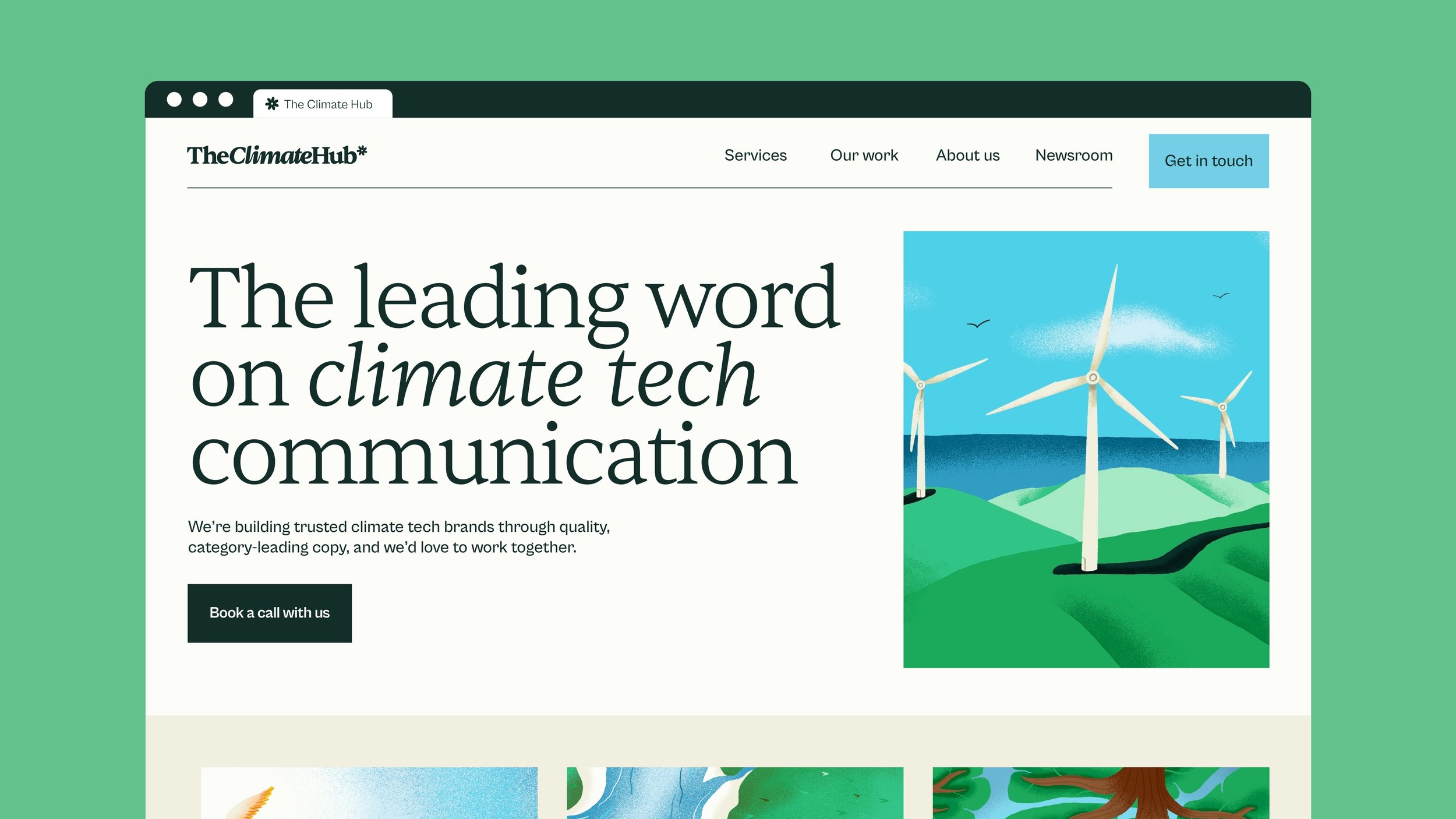
The leading word on climate tech
The overall goal with The Climate Hub’s brand is to position them as the leading word on climate tech communication. They want to be known as the go-to experts on messaging, copy, and strategy for climate companies.
To achieve this, we created a brand around two main things: expert communication, and the climate. By prioritising these in the visual branding, it would instantly and continually convey their positioning as the leading word on climate tech communication.
This meant an editorial style that established their trusted expertise, and earth-inspired colors and illustrations that connect to the climate.
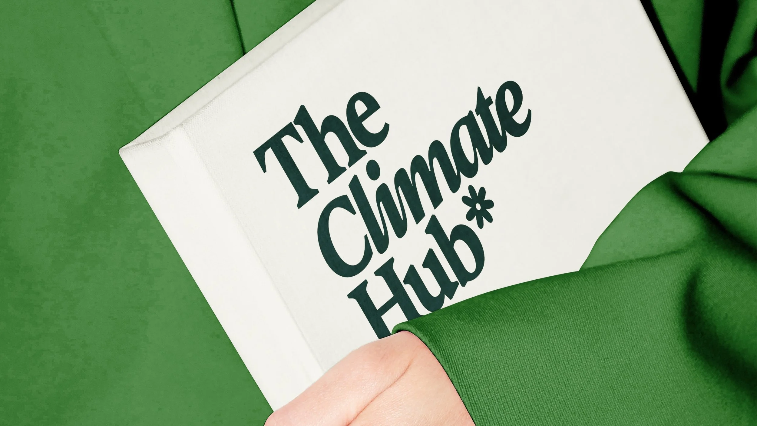
Logo Design
Category-leading climate copy
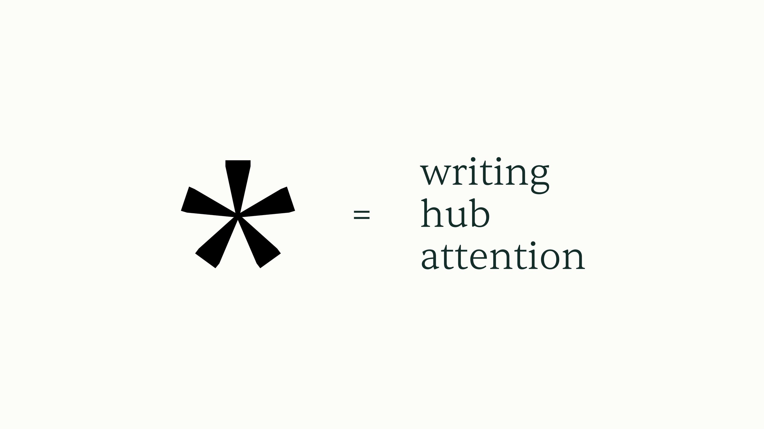
The logo design for The Climate Hub is based on an asterisk. This asterisk represents many parts of the brand’s positioning. First is the most obvious as the punctuation mark is indicative of writing, editing, and communication. Secondly, it visually shows multiple parts meeting together in the centre, and Amelia and Meg are building The Climate Hub as a go-to place for climate tech communication. And lastly, the asterisk is used to call attention to something, and this is exactly what their work aims to do, calling attention to their clients’ businesses and the climate overall.
This asterisk was then stylised into a flower to make a more obvious connection to earth to further reinforce the Climate-focused industry positioning.
Paired with a professional and journalistic but but human, rounded Serif typeface, this logo is a strong representative of The Climate Hub brand.

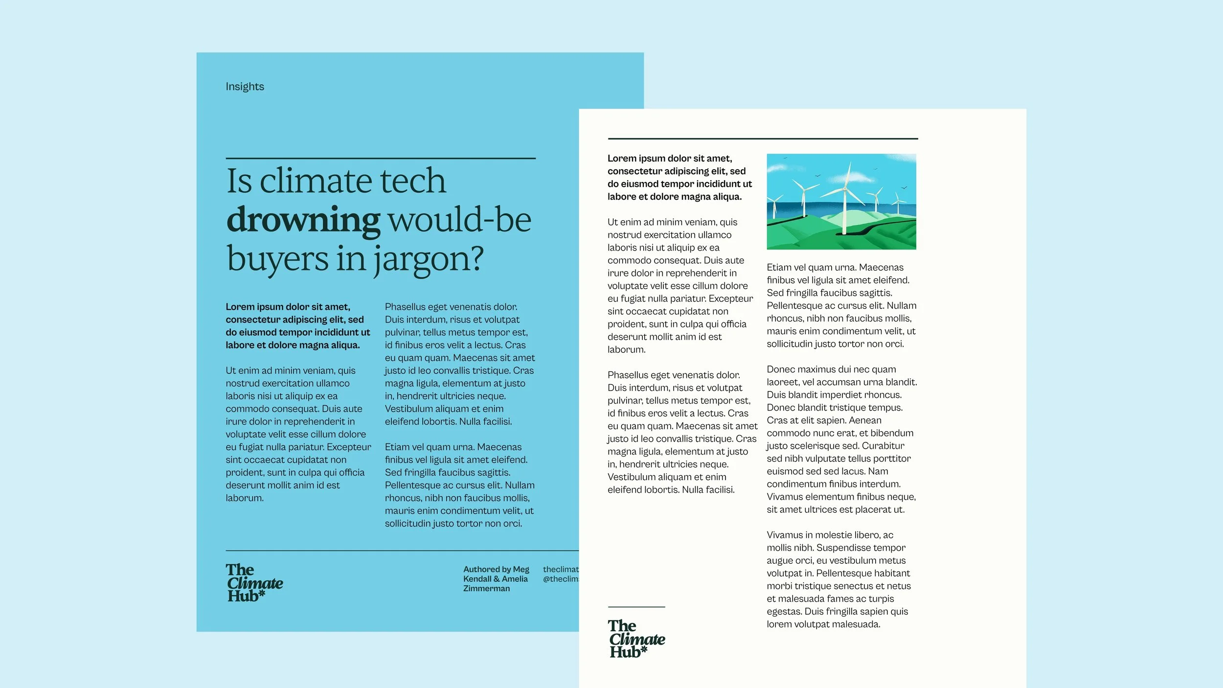
Brand Identity
Editorial expertise
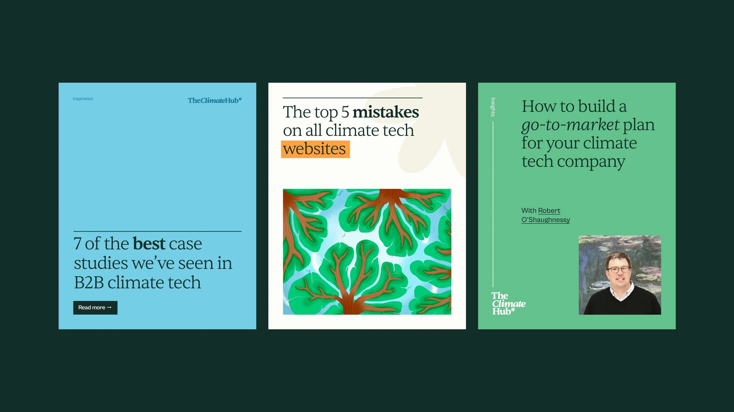
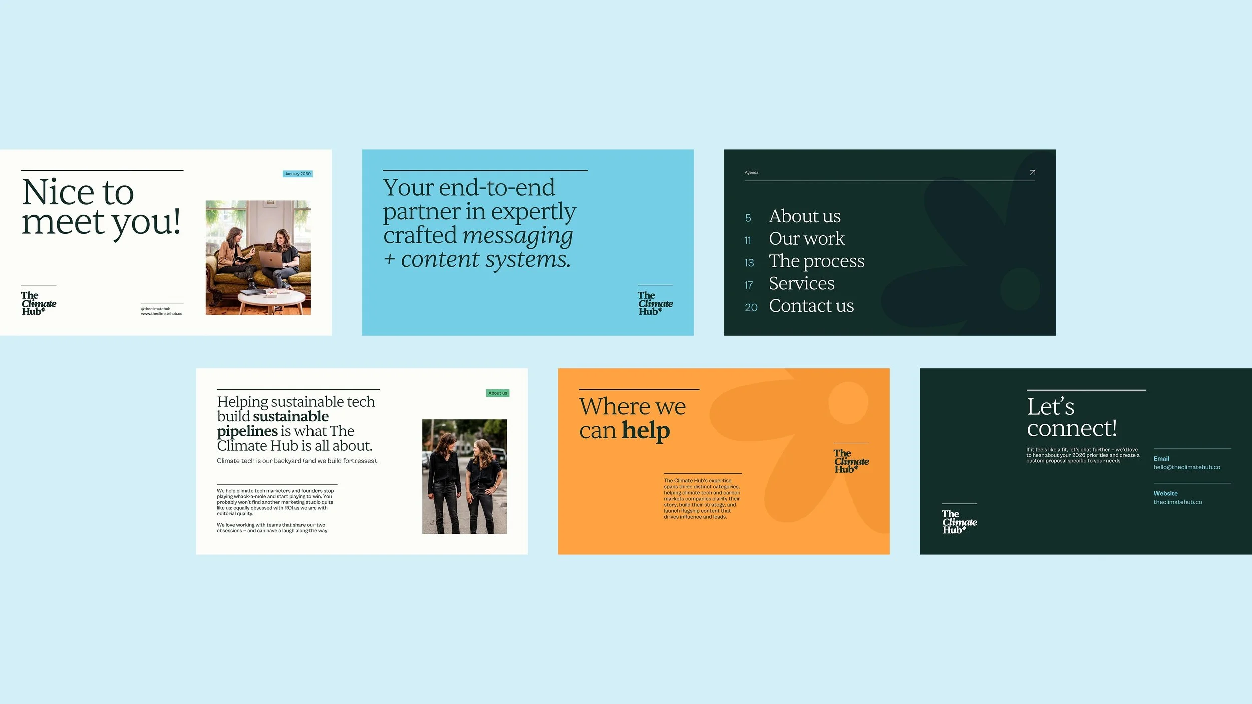
To position The Climate Hub as the leading word in climate tech communication, I wanted to visually show that with editorial styling that emphasized their expertise.
I used clean editorial layouts with a strong underlying grid system, simple, strong typography emphasized by lots of space, and thin rule lines that bring structure to the information.
These simple elements come together to create a brand that feels category-leading and invites trust from the outset.
Illustration
Drawing the distinction
While the majority of The Climate Hub brand is simple, clean, and structured, what sets it apart from other brands is the illustration. To make the brand truly distinct, and reinforce the human, organic side that prioritises people and planet, I created an illustration style to complement the brand.
These illustrations are textured, organic, bright, and optimistic.
This style, along with the climate-focused subject matter, communicates the brand’s personality and perspective perfectly.


“We’re super happy with our beautiful branding from Hollie — it totally captures
our vibe and we could never have gotten to where we are without her.”